Wednesday, October 31, 2012

First Marking Period Relection

This first marking period flew by, and I can't say I'm unhappy about it. My college applications are almost finished, relieving one of the biggest stresses in my life, and soon enough the end of the year will be here and I'll be off on my own. I'm not really sure what I was like starting out, I mean, I have definitely changed from Freshman year to Senior year, but from the beginning of this year to now I don't feel like much has changed. In the art aspect, I'm pretty confident to say I'm more of a risk taker with my art. Oddly enough, after deciding not to pursue an art major, I think my art has gotten better because I'm not so focused on perfection. I feel like I can take risks in art and leave the imperfections the way they are because I don't have the pressure of getting a portfolio together and making sure every piece looks neat and spotless. The imperfections are starting to look better to me, almost like someone who looks disheveled but is still classy. I have to say this freedom has benefited me and hopefully I can take these risks and apply them to future my future works creations.

I hope to finish out my last year of art with a bang, meaning taking more risks, looking at things more abstractly, and changing up my usual methods to something I've never tried before or simply experimenting with new.

And to start, I did another little poster piece once I was finished my President college. I wanted to put it in my book but from the modeling clay I added I don't think I'll be able to. I really like how it came out there, playing around with dark and lights as usual.
 

Next President Collage


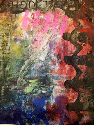
 Our next assignment was to create a poster for the next president. I currently have no clue on who the next president should be nor am I really into politics. So I decided to use my poster to advocate an issue: gay rights. I am in full support of gay rights and gay marriage and hopefully my poster is a good representation of this. I think I did a weird twist to my collage because most posters advocating this issue are usually bright and colorful, almost always a rainbow. I chose to take a darker side (no surprise there) and show that there are two sides to the story and hopefully the side I want comes through.


While looking at my poster the sides are very contradictory. The left side is colorful, a muted rainbow. Then on the right you'll side darker colors, mainly red and black. I'm hoping to represent the people that support gay rights and then the people that don't. On top of the colors, you'll see paper men. I had fun trying to relearn how to cut paper men out, but successfully, with few deformities, I did it. At the top there are pink paper women (women), at the bottom there are blue paper men (men), and then on the side there are black paper men, (men and women). They're all holding hands, representing the different kinds of love/marriages out there. The black paper men are on the right are engulfed by red and black because society thinks marriage should only be between a man and a women and look down on same sex couples from marrying.The blue guys are at the bottom, mainly to the left for support of gay marriage. Also, the very last blue man is not joined by the others and is almost consumed by red, representing how the disapproval of gay marriage can be consuming and overwhelming, as well as violent.

There are a lot of different aspects of my poster that can't all be taken in at once, which is what I wanted to happen. You have to look at it closely and then it will tell you more about what you're viewing.. There are many layers to this, just like there are many layers to people and their opinions. Hopefully my poster will show you how not all layers matter and that people are people and who people decide to marry makes no difference to who they are.




Shoe Drawing

 Like previous years, we started off the year with a still life drawing. This year we decided to draw shoes, because unlike the years before they don't ripen or begin to rot, so we had a while to work on them. At my table I found this lovely moccasin laying there and it was mainly the laces that inspired me to make my focus point only on this one shoe. I loved the way the laces contoured around the shoe and the shadows and texture of the shoe itself. I thought about adding more shoes like everyone else, but I decided to blow this one shoe up to take over the page of my paper. It was somewhat of a challenge for me to take the real size of the shoe and enlarge it. Usually I like to draw to size, but it was a risk I felt I could manage.

The whole drawing process was fun. I liked being able to focus on just one thing but because I was focusing on one shoe I was able to spend more time adding more details to it. I worked on the laces first and then began the base of the shoe. What I like about drawing is I can jump around on the page if I get bored or uninspired in the spot I'm currently working on. The sketching process went well and I felt like I really developed my drawing.

I added color to my shoe, one of few people who added color to their sketches, because I thought color was mandatory to add. It wasn't. But thinking it was pushed me out of my comfort zone because I usually hate adding color. I prefer drawing in black and white because it usually looks neater and messing up can be easily covered. While using colored pencil I was fearful of undoing all my hard work of my drawing, but eventually I got over that fear and just went for it. I chose colors that went along with the colors in the background; navy blue, red, orange, yellow. I wanted to try and stay away from colors like black and white and simply manipulate the other colors to look the same, but in certain areas you can tell I gave in and did the shadows in black and highlights in white. It was worth a shot at least. I think the coloring came out really well, to my surprise. I had difficulty in certain areas due to the weirdness of the shoe but after understanding what I was really seeing it was easier to shade in the shadows to make the drawing 'pop'. I really like the out come of my shoe drawing because it's different; many of my drawings are in black and white pencil, so having this in color makes it really stand out.