Wednesday, October 31, 2012

First Marking Period Relection

This first marking period flew by, and I can't say I'm unhappy about it. My college applications are almost finished, relieving one of the biggest stresses in my life, and soon enough the end of the year will be here and I'll be off on my own. I'm not really sure what I was like starting out, I mean, I have definitely changed from Freshman year to Senior year, but from the beginning of this year to now I don't feel like much has changed. In the art aspect, I'm pretty confident to say I'm more of a risk taker with my art. Oddly enough, after deciding not to pursue an art major, I think my art has gotten better because I'm not so focused on perfection. I feel like I can take risks in art and leave the imperfections the way they are because I don't have the pressure of getting a portfolio together and making sure every piece looks neat and spotless. The imperfections are starting to look better to me, almost like someone who looks disheveled but is still classy. I have to say this freedom has benefited me and hopefully I can take these risks and apply them to future my future works creations.

I hope to finish out my last year of art with a bang, meaning taking more risks, looking at things more abstractly, and changing up my usual methods to something I've never tried before or simply experimenting with new.

And to start, I did another little poster piece once I was finished my President college. I wanted to put it in my book but from the modeling clay I added I don't think I'll be able to. I really like how it came out there, playing around with dark and lights as usual.
 

Next President Collage


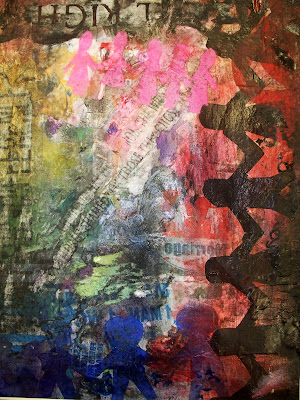
 Our next assignment was to create a poster for the next president. I currently have no clue on who the next president should be nor am I really into politics. So I decided to use my poster to advocate an issue: gay rights. I am in full support of gay rights and gay marriage and hopefully my poster is a good representation of this. I think I did a weird twist to my collage because most posters advocating this issue are usually bright and colorful, almost always a rainbow. I chose to take a darker side (no surprise there) and show that there are two sides to the story and hopefully the side I want comes through.


While looking at my poster the sides are very contradictory. The left side is colorful, a muted rainbow. Then on the right you'll side darker colors, mainly red and black. I'm hoping to represent the people that support gay rights and then the people that don't. On top of the colors, you'll see paper men. I had fun trying to relearn how to cut paper men out, but successfully, with few deformities, I did it. At the top there are pink paper women (women), at the bottom there are blue paper men (men), and then on the side there are black paper men, (men and women). They're all holding hands, representing the different kinds of love/marriages out there. The black paper men are on the right are engulfed by red and black because society thinks marriage should only be between a man and a women and look down on same sex couples from marrying.The blue guys are at the bottom, mainly to the left for support of gay marriage. Also, the very last blue man is not joined by the others and is almost consumed by red, representing how the disapproval of gay marriage can be consuming and overwhelming, as well as violent.

There are a lot of different aspects of my poster that can't all be taken in at once, which is what I wanted to happen. You have to look at it closely and then it will tell you more about what you're viewing.. There are many layers to this, just like there are many layers to people and their opinions. Hopefully my poster will show you how not all layers matter and that people are people and who people decide to marry makes no difference to who they are.


Shoe Drawing

 Like previous years, we started off the year with a still life drawing. This year we decided to draw shoes, because unlike the years before they don't ripen or begin to rot, so we had a while to work on them. At my table I found this lovely moccasin laying there and it was mainly the laces that inspired me to make my focus point only on this one shoe. I loved the way the laces contoured around the shoe and the shadows and texture of the shoe itself. I thought about adding more shoes like everyone else, but I decided to blow this one shoe up to take over the page of my paper. It was somewhat of a challenge for me to take the real size of the shoe and enlarge it. Usually I like to draw to size, but it was a risk I felt I could manage.

The whole drawing process was fun. I liked being able to focus on just one thing but because I was focusing on one shoe I was able to spend more time adding more details to it. I worked on the laces first and then began the base of the shoe. What I like about drawing is I can jump around on the page if I get bored or uninspired in the spot I'm currently working on. The sketching process went well and I felt like I really developed my drawing.

I added color to my shoe, one of few people who added color to their sketches, because I thought color was mandatory to add. It wasn't. But thinking it was pushed me out of my comfort zone because I usually hate adding color. I prefer drawing in black and white because it usually looks neater and messing up can be easily covered. While using colored pencil I was fearful of undoing all my hard work of my drawing, but eventually I got over that fear and just went for it. I chose colors that went along with the colors in the background; navy blue, red, orange, yellow. I wanted to try and stay away from colors like black and white and simply manipulate the other colors to look the same, but in certain areas you can tell I gave in and did the shadows in black and highlights in white. It was worth a shot at least. I think the coloring came out really well, to my surprise. I had difficulty in certain areas due to the weirdness of the shoe but after understanding what I was really seeing it was easier to shade in the shadows to make the drawing 'pop'. I really like the out come of my shoe drawing because it's different; many of my drawings are in black and white pencil, so having this in color makes it really stand out.

Monday, September 10, 2012

First post of the year!


School is in session once more and I’m very excited to journey back as a senior. I’m expecting this year to be the best if not most stressful and making it out of junior year makes me feel fully confident that I will survive senior year. One of the things I’m looking forward to the most, probably along with all other seniors, is the senior trip. A class trip to Florida where we will have free range of the parks. I think this trip will conquer all others because we’ll be on our own doing things at our own pace. Along with class trip, I have crew to look forward to, even though it isn’t something most people are happy about. Fall season is very slow and tedious because there aren’t many races to look forward to, but once winter comes all hell will break loose and if we survive, spring is something to look forwards to. Over the summer I thought about the goals I would have for the school year, and the biggest one would be getting straight A’s every marking period so I can avoid dreaded finals. I’m naturally an A-B student but if I can avoid finals in most of my classes I would be happy because A) I wouldn’t have to take them and B) I managed to get straight A’s for the whole year. Big accomplishment on my part there. But another goal I have is to be friendlier and more talkative. Now I know teachers cringe at the thought of talkative students, but for me that’s merely saying hi in the halls or asking about someone’s weekend. I have always been very quiet and sometimes shy, but this year I hope to change that and be more outgoing and speak up. So far I feel like both of these goals are going well.

From freshman year I planned on majoring in graphic design for college. By senior year my major changed to Food Science. So why am I back for another year of art? Simply because I love it.  I may not be going to college for art, but it is still a huge part of my life and I can’t imagine myself without it. The class is fun and I love creating unique master pieces from scrapes of paper or strokes of a brush. It’s soothing and calming, but also exciting and wild. Life without art would be so banal and in order to bring some color into my life, I have to have my daily dose of art class.

Monday, June 4, 2012

Reflection 2.0

When midterms came around we were supposed to talk about how we feel about our growth and development in both ourselves and our artwork. I said I didn't feel any different, that everything was the same for me in both categories and that things haven't changed much from the last year. Now that it is the end of the year I laugh at my last post because by now, things have changed extraordinarily.

First of all, regarding art I've developed an insane amount of patients when it comes to working on a piece. I know if I put the effort and time into something then the outcome will be worth it. Before I never wanted to take the task of even beginning the more challenging task. Now I feel fully capable of jumping right in and even though it may take a few weeks to roll the ball, once it's rolling it goes smoothly till the very end and turns out just as I imagine. I know now not to be afraid to jump into something and just take it head on. 

Also, I feel like my artwork, along with myself, has matured over the year. My art sense has changed, and I can tell the difference from the book I made last year and the book I'm making this year. I like the change, I think it's just another part of me coming into light that's been hidden these past years. I hope I continue to grow and change this way and keep getting new ideas and ways to express them.

I'm not really sure what my role in everything is. I feel like from the things happening around me it has shaped who I am and who I'm becoming. There isn't really much to change about that except to take it as it comes and go along. From the beginning of junior year to the end, I've come to many realizations bout my friends, my art, and my future that I wouldn't have thought about before. I can't say I'm all that fond of what I'm coming to terms with, but I guess it's just another part of growing and learning.

Can't wait to see what the end of senior year holds for me.


Sunday, June 3, 2012

Extra Credit


My Place Setting

This year we were presented with the task of dedicating a place to someone of our choice. I chose my grandfather, a Navy Veteran who has been deceased for six years. As some kids idolized their fathers, I idolized him. He was my hero; he made me laugh and taught me jokes, he cleaned my scrapes and kissed my bruises,  he taught me how to repair broken things using only my hands and my wit. I never realized how important he was to me until he died. Even after he died I never realized at my young age, but as I grow up it's becoming more apparent to me.

 For my place setting, I chose the Navy aspect of his life. He was in the Navy for two years, working on the ships by repairing them or readying them for battle. For my nonfunctional piece I made it my bowl, which is a battle ship. I would have to say this was the most time consuming piece because it was a very tedious job sculpting the parts and putting them together. Many times I asked myself why in the world am I doing this when there would be a much simpler solution. But I pushed through and came out with a nice little battle ship. I'm quite pleased with how it turned out, because half the time I thought it might explode in the kiln or something would break off. But everything turned out fine, which makes me happy. 

One of my plates is a sailor's hat. It wasn't too difficult but it didn't really come out as well as I wanted it to. Unless you knew what one of those little white hats looked like, you probably wouldn't know what it was you were looking at with my plate. As for my second plate, I made an anchor. I'm much happier with this piece. Making it was really fun, even though there are lots of uneven spots in the thickness of the clay. But it was fun to make but terrible to glaze. I wanted to make it look nautical, with the blue and white and some red. It turned out a little Americanized, but I still think it looks good. It only the back that the lines are thinner which made it harder to do a quick glazing. I didn't have much time either, to glaze since this was my last piece and I chose the pattern in three different nonconsecutive colors. But I got it done and the colors didn't melt together too badly so it came out clear and precise! As for my cup, I'm not sure what's going on there since the cup doesn't really have to do with anything. It's a triangle and it has a neat little stand to sit up on. That's it. It's different and weird, and since my grandfather was different and weird I guess it makes sense.


 It was fun to create since we had more of a purpose with the clay, rather than just making bowls. I'm happy with the setting and it's representation, and I think my grandfather would be happy with it as well.